Description
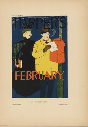
Edward Penfield had this gift for catching real life and making it beautiful without trying too hard. In this February cover for Harper’s, there’s a man in a bright yellow coat standing at a blue mailbox in the moonlight, dropping a letter into the night. It’s such a simple scene—just a guy, a mailbox, the cold suggestion of winter in those deep blues—but there’s something quietly poetic about it. The bold orange lettering for “HARPER’S” and “FEBRUARY” sits right there, anchoring everything, and the way the figure stands tells you this moment matters to him. This is the kind of vintage poster that makes you think about the small rituals of city life back in 1897, and you can feel how much Penfield loved capturing that.
What strikes you about Penfield’s work is how he doesn’t overthink it. A lot of artists in that era would have thrown decorative details everywhere, loaded the thing with symbolism. Penfield just… trusts what he’s got. A silhouette. A handful of colors. Perfect balance. That yellow coat becomes the focal point against all that cool blue and black, and the mailbox anchors the whole composition. Even the figure himself has this real presence—there’s thoughtfulness in how he’s standing, like posting a letter is something worth paying attention to. If you’re collecting American Art Nouveau or vintage magazine graphics, this is the kind of piece that shows you exactly why Penfield mattered so much to Harper’s and why people still care about his work today.
What’s really significant is that Penfield’s work ended up in Les Affiches Étrangères Illustrées alongside Europe’s greatest artists. This wasn’t some second-tier collection—it was the real deal. Published between 1897 and 1899 by G. Boudet in Paris, printed by the legendary Imprimerie Chaix using Jules Chéret’s groundbreaking color techniques, this series represented poster art at its absolute best. They only made 1,050 copies of each image on fine vellum paper, each one numbered and documented. The fact that Penfield was included tells you everything about how seriously the international art world took American commercial design.
This copy has been matted in museum-quality archival materials and comes IVPDA certified. The fine vellum has aged beautifully—you can still see the full richness of those chromolithographic inks. Whether you’re deep into American Art Nouveau, you collect vintage magazine history, or you just love the kind of design that knows when to stop and let simplicity speak, this 1897 Harper’s poster delivers. It’s a real piece of that moment when magazine illustration and fine art lived in the same world, and it’s only getting harder to find.

Reviews
There are no reviews yet.