Description
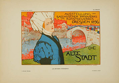
Here’s what Fischer grasped when designing Die Alte Stadt: exhibition marketing isn’t about the institution—it’s about transformation. The woman’s profile in this striking composition gazes toward the heart of the design where architecture, pattern, and color converge. Die Alte Stadt captures that contemplative moment perfectly. The color palette—burnt orange, cream, blue, red, and green—creates visual complexity that mirrors what students experience inside the Kunstgewerbe Schule. This wasn’t decoration. This was institutional philosophy made visible through Die Alte Stadt‘s layered composition. The Sächsisch-Kgl. Kunstgewerbe Schule (Royal Saxon School of Applied Arts) wasn’t marginal; it was one of Central Europe’s most respected design institutions, and Fischer was trusted to announce Die Alte Stadt exhibition to the Continental art world.
What’s extraordinary is that Boudet selected Die Alte Stadt as essential enough for Les Affiches Étrangères Illustrées. This reveals something crucial about his vision: prestige transcended nationality entirely. The collection included British, American, Belgian, and now this Austrian-German masterpiece because merit was the only criterion. Fischer’s ability to compress the institutional mission into Die Alte Stadt—the contemplative woman, the architectural complexity, the color sophistication—earned him a place alongside Beardsley, Donnay, and Berchmans. You’re acquiring Die Alte Stadt as evidence that Belle Époque institutions recognized that design excellence was stateless.
The technical mastery of Die Alte Stadt rewards close study. Fischer’s line work achieves psychological depth through restraint. The woman’s expression in this composition communicates intellectual engagement without sentimentality. The architectural elements create a visual rhythm that suggests complexity and possibility without overwhelming the design. The fine vellum stock preserves every nuance of the lithographic process in Die Alte Stadt. Chaix printers understood they were serving institutional vision, not merely producing advertising material.
You’re holding one of 1,025 justified copies of Die Alte Stadt from a collection that centered Germanic design tradition alongside Western European masters. That inclusion—Fischer’s Die Alte Stadt within the same edition as American, British, and Belgian artists—authenticates something essential about 1897 institutional thinking. Geographic origin was irrelevant. Language didn’t matter. Professional prestige recognized only excellence. Die Alte Stadt connects you to a moment when serious institutions hired the boldest talent available, regardless of cultural origin, because design vision was the universal language that mattered.

Reviews
There are no reviews yet.